# Theming & Styling
Source: https://inspectorlab.dev/theming
> For the complete documentation index, see [llms.txt](https://inspectorlab.dev/llms.txt).
# Theming & Styling
Inspector Lab's theming system is built on a carefully designed architecture that allows the DevTools-styled inspector to adapt seamlessly between light and dark modes, and to optionally swap in the extension's own branding palette.
## Theme Gallery
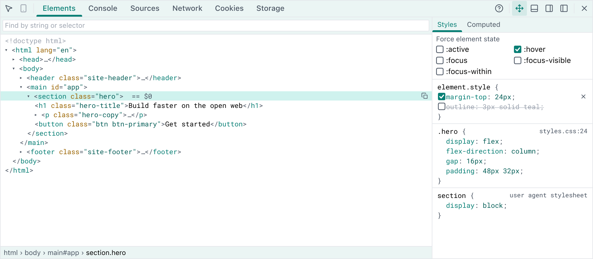
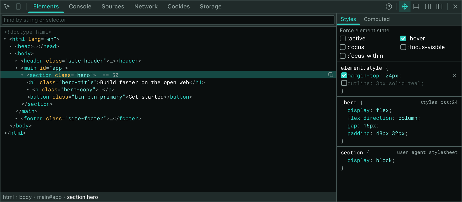
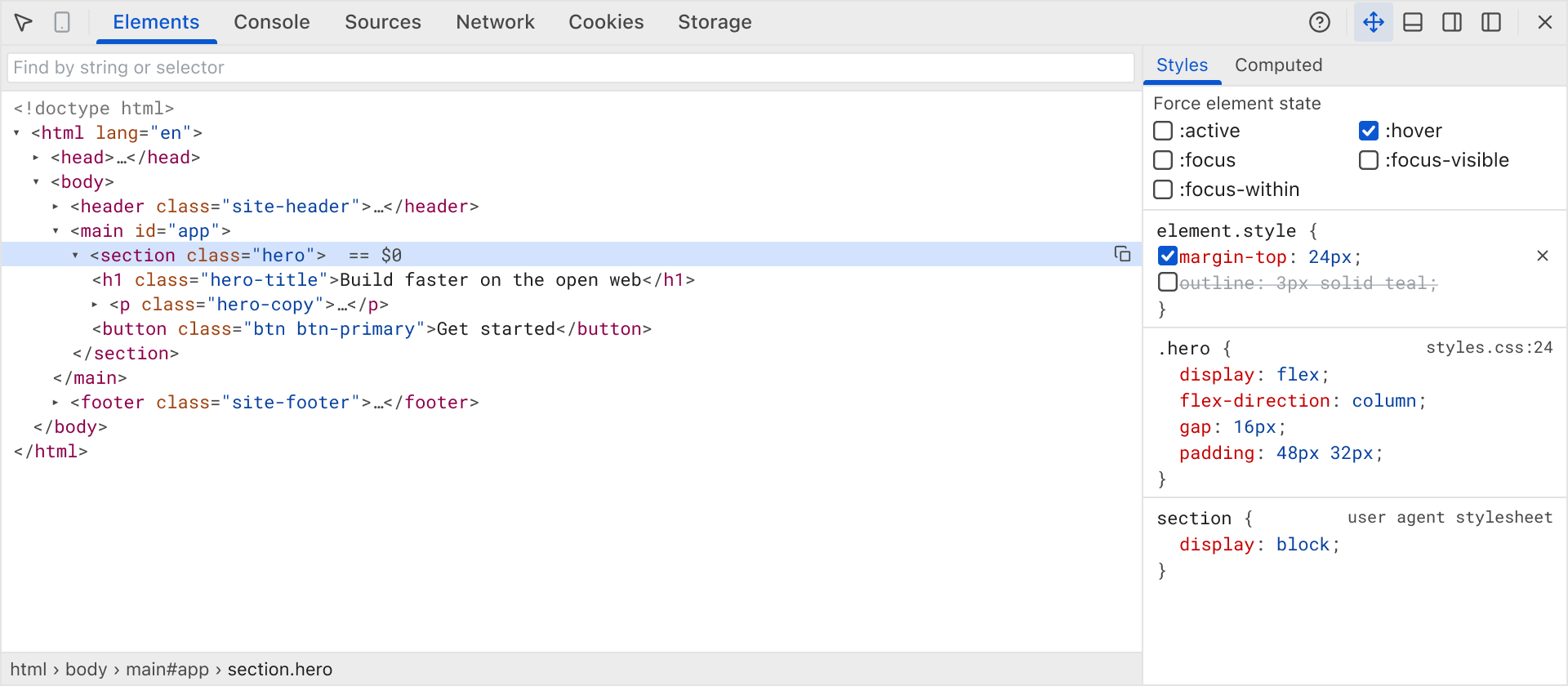
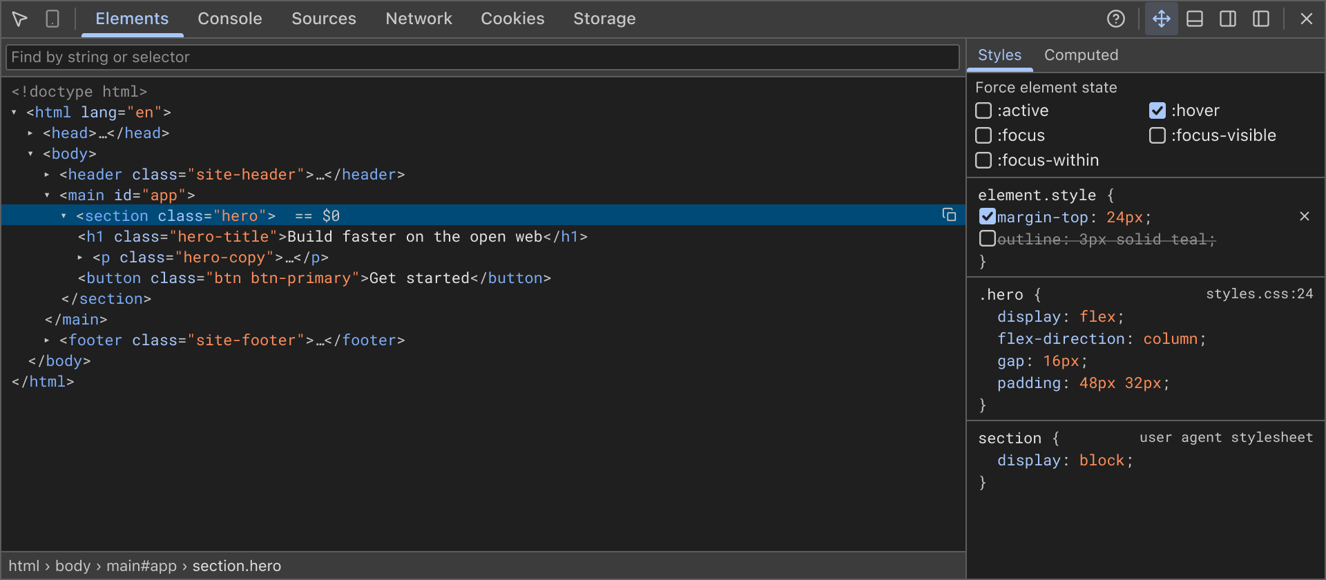
The four theme variants side by side — the branded palette and the classic Chrome DevTools look, each in light and dark mode:
 ## Architecture Overview
The theme system consists of three main layers:
1. **Base Design Tokens** — Metrics (typography, spacing, sizing) and colors organized under the `DevtoolsTokens` interface
2. **Theme Variants** — Light, dark, and branded combinations that apply tokens consistently
3. **Styled Components** — Reusable CSS building blocks that consume tokens from `theme.devtools`
This separation ensures that every UI surface—the popup, the inspector panel, dialogs—reads the same values and stays in sync across modes.
## Design Tokens
<Field value="DevtoolsTokens" type="interface" required>
The complete set of design tokens available to styled components. Organized into typography, spacing, colors, and syntax highlighting.
</Field>
### Typography
| Token | Default | Purpose |
|-------|---------|---------|
| `fontFamily` | System sans stack | UI chrome: toolbars, tabs, labels |
| `monoFamily` | Monospace stack | Code, DOM nodes, computed values, console output |
| `fontSize` | `12px` | General UI text size |
| `fontSizeSmall` | `11px` | Secondary labels, headers |
| `monoFontSize` | `11px` | Monospace text (syntax, values) |
| `lineHeight` | `1.4` | Line spacing across all text |
The two font stacks in full:
```ts
fontFamily: '-apple-system, BlinkMacSystemFont, "Segoe UI", system-ui, sans-serif',
monoFamily: 'Menlo, Monaco, "SF Mono", "Roboto Mono", Consolas, "Liberation Mono", "Courier New", monospace',
```
### Spacing & Sizing
| Token | Default | Purpose |
|-------|---------|---------|
| `toolbarHeight` | `27px` | Height of toolbar rows and main tab strip |
| `tabHeight` | `27px` | Tab button height |
| `rowHeight` | `15px` | Single dense tree/grid row |
| `treeIndent` | `12px` | Horizontal offset per DOM tree depth level |
| `touchTarget` | `24px` | Finger-sized tap area on touch devices |
### Colors
The default light mode mirrors Chrome DevTools' own palette. Dark mode and branded variants derive all their colors from the same tokens:
```ts
interface DevtoolsTokens {
// Panel & control backgrounds
surface: string; // Panel body background (white/dark)
surfaceSubtle: string; // Recessed background for sidebars
toolbar: string; // Toolbar and tab strip background
// Text colors
text: string; // Primary text
textSubtle: string; // Secondary / disabled text
textDisabled: string; // Low-contrast text
// Interaction colors
accent: string; // Primary interactive color (blue)
accentSubtle: string; // Accent with reduced opacity
onAccent: string; // Text/glyphs on accent background
focusRing: string; // Focus outline color
// Tab and row states
tabSelectedText: string; // Selected tab color
tabHoverBackground: string; // Tab hover fill
tabIndicator: string; // 3px slider bar under tab
rowHover: string; // Row hover background
rowSelected: string; // Selected row (focused)
rowSelectedBlur: string; // Selected row (blurred)
// Borders
border: string; // 1px separators
borderStrong: string; // Heavier pane split borders
}
```
### Syntax Highlighting
Code in the Elements and Sources panels uses a dedicated palette:
```ts
syntax: {
tag: string; // HTML/XML tag names
attributeName: string; // Attribute identifiers
attributeValue: string; // Quoted attribute values
text: string; // Text node content
comment: string; //
doctype: string; //
punctuation: string; // Brackets, angle brackets
property: string; // CSS property names
value: string; // CSS property values
number: string; // Numeric literals
string: string; // String literals
keyword: string; // Keywords (class, id, etc.)
}
```
### Status Colors
Console messages and Network statuses use semantic colors:
```ts
status: {
error: string;
errorBackground: string;
errorBorder: string;
warning: string;
warningBackground: string;
warningBorder: string;
info: string;
success: string;
}
```
### Box Model Diagram
The Computed panel's box-model visualization uses pastel fills (identical across light and dark modes for consistency):
```ts
boxModel: {
margin: string; // #f9cc9d (orange)
border: string; // #fdd291 (yellow)
padding: string; // #c3d08b (green)
content: string; // #a1c2cf (blue)
text: string; // #222222 (always dark for readability)
}
```
## Theme Variants
Inspector Lab provides four complete theme configurations:
<Tabs>
<TabContent title="Light (Default)">
The default light theme mirrors Chrome DevTools' own `baseline-grayscale` skin: white surface, light gray toolbars, blue accents.
```ts
export const theme: AppTheme = {
...base,
colors: brandColorsLight,
fonts: { ...base.fonts, ...brandFonts },
devtools: devtoolsLight,
};
```
</TabContent>
<TabContent title="Dark">
Dark mode inverts the palette: dark surfaces, darker toolbars, light blue accents. Uses the same metrics as light so UI density is identical.
```ts
export const themeDark: AppTheme = {
...baseDark,
colors: brandColorsDark,
fonts: { ...baseDark.fonts, ...brandFonts },
devtools: devtoolsDark,
};
```
</TabContent>
<TabContent title="Branded Light">
The popup's "custom inspector theme" toggle swaps in the extension's own branding palette (teal primary, amber secondary). All colors derive from the Cherry theme—the inspector and popup can never drift apart.
```ts
export const themeBranded: AppTheme = {
...theme,
devtools: brandDevtools(brandColorsLight, false),
};
```
</TabContent>
<TabContent title="Branded Dark">
Branded palette in dark mode. Maintains the same semantic color meanings as the default dark theme (light accents on dark surfaces) while swapping the hue.
```ts
export const themeDarkBranded: AppTheme = {
...themeDark,
devtools: brandDevtools(brandColorsDark, true),
};
```
</TabContent>
</Tabs>
## Theme Resolution
The active theme is determined by the user's color-scheme preference and branding toggle:
```ts
export function resolveInspectorTheme(
isDark: boolean,
branded: boolean,
): AppTheme {
if (branded) return isDark ? themeDarkBranded : themeBranded;
return isDark ? themeDark : theme;
}
```
The `ThemeProvider` component reads the initial preference from `localStorage.theme` (or falls back to the OS color-scheme preference) and applies it via `cherry-styled-components`' `ClientThemeProvider`:
```tsx
function resolveInitialTheme(): "light" | "dark" {
try {
const stored = localStorage.theme;
if (stored === "dark" || stored === "light") return stored;
} catch {
// Fall back to the operating-system preference.
}
return window.matchMedia?.("(prefers-color-scheme: dark)").matches
? "dark"
: "light";
}
export function ThemeProvider({ children }: { children: ReactNode }) {
return (
{children}
);
}
```
## Styled Component Building Blocks
All DevTools panels are assembled from reusable CSS mixins and styled components, ensuring consistency across surfaces and modes. Every mixin reads from `theme.devtools`:
### Typography Mixins
**`devtoolsUi`** — System sans font for UI chrome (toolbars, tabs, labels):
```ts
export const devtoolsUi = css`
color: ${({ theme }) => theme.devtools.text};
font-family: ${({ theme }) => theme.devtools.fontFamily};
font-size: ${({ theme }) => theme.devtools.fontSize};
line-height: ${({ theme }) => theme.devtools.lineHeight};
`;
```
**`devtoolsMono`** — Monospace font for code, values, and console output:
```ts
export const devtoolsMono = css`
color: ${({ theme }) => theme.devtools.text};
font-family: ${({ theme }) => theme.devtools.monoFamily};
font-size: ${({ theme }) => theme.devtools.monoFontSize};
line-height: ${({ theme }) => theme.devtools.rowHeight};
`;
```
### Scrollbar Styling
**`devtoolsScrollbar`** — Slim overlay scrollbar (Firefox and WebKit):
```ts
export const devtoolsScrollbar = css`
scrollbar-width: thin;
scrollbar-color: ${({ theme }) => theme.devtools.scrollbarThumb} transparent;
&::-webkit-scrollbar {
width: 10px;
height: 10px;
}
&::-webkit-scrollbar-thumb {
background: ${({ theme }) => theme.devtools.scrollbarThumb};
background-clip: padding-box;
border: solid 2px transparent;
border-radius: 10px;
}
/* ... */
`;
```
### Touch & Interaction
**`touchHitArea(anchor)`** — Finger-sized tap area drawn as a pseudo-element (no layout cost):
The DevTools inspector runs on iPads where a 15px row is unhittable. Row density is preserved by growing a 24px hit area as an absolutely positioned `::after` pseudo-element anchored to the nearest container edge.
```ts
export const touchHitArea = (anchor: "left" | "right") => css`
&::after {
content: "";
position: absolute;
top: 50%;
${anchor}: 0;
width: ${({ theme }) => theme.devtools.touchTarget};
height: ${({ theme }) => theme.devtools.touchTarget};
transform: translateY(-50%);
}
`;
```
**`rowActionButton(size)`** — Hover-revealed per-row action (delete, edit):
Row actions start invisible and reveal on hover, focus, or on devices with no hover capability:
```ts
export const rowActionButton = (size: number) => css`
button {
position: relative;
width: ${size}px;
height: ${size}px;
/* ... */
opacity: 0;
pointer-events: none;
/* Focus reveals the button so keyboard never chases invisibility. */
&:focus-visible {
outline: solid 1px ${({ theme }) => theme.devtools.focusRing};
outline-offset: -1px;
opacity: 1;
pointer-events: auto;
}
}
/* No hover capability: show always. */
@media (hover: none) {
button {
opacity: 1;
pointer-events: auto;
}
}
`;
```
### Form Control Overrides
**`devtoolsCheckbox`** — Restyles Cherry's checkbox into a compact 12px box:
```ts
export const devtoolsCheckbox = css`
&& input {
width: 12px;
height: 12px;
background: transparent;
border: solid 1px ${({ theme }) => theme.devtools.textSubtle};
border-radius: 2px;
}
&& input:checked {
background: ${({ theme }) => theme.devtools.accent};
border-color: ${({ theme }) => theme.devtools.accent};
}
&& svg {
width: 8px;
height: 8px;
color: ${({ theme }) => theme.devtools.onAccent};
}
`;
```
**`DevtoolsField`** — Shrinks Cherry form controls from 40px to 19px (DevTools' compact scale):
Borderless variant (`$plain`) for the console prompt and editable grid cells:
```tsx
{/* Input inherits font from surrounding surface */}
```
**`DevtoolsButtonGroup`** — Text buttons (20px height) for panels and dialogs:
```ts
export const DevtoolsButtonGroup = styled.div`
button {
height: 20px;
padding: 0 8px;
background: ${({ theme }) => theme.devtools.toolbar};
border: solid 1px ${({ theme }) => theme.devtools.border};
border-radius: 2px;
/* ... */
}
`;
```
### Layout Components
| Component | Purpose |
|-----------|---------|
| `InspectorWindow` | Whole floating window: flat, square-cornered DevTools frame with optional shadow |
| `WindowToolbar` | Top row: picker controls, tab strip, window actions; also the drag handle |
| `TabStrip` | Main tabs (Elements, Console, Network, etc.) |
| `Tab` | Single tab button with 3px rounded slider indicator |
| `PanelHost` | Container for the active panel |
| `Panel` | Panel's root: fills the window and scrolls internally |
| `PanelToolbar` | Secondary toolbar inside a panel (filters, actions) |
| `SplitView` / `SplitMain` / `SplitSidebar` | Three-column layout (main + sidebar) |
| `Scroller` | Any scrolling region inside a panel |
| `SubTabBar` / `SubTab` | Sub-tabs (Styles / Computed, underlined not filled) |
| `PaneHeader` | Collapsible section heading inside a sidebar |
| `DataGrid` | Network request table, styled like DevTools' data grid |
| `GridRow` / `GridActionCell` | Table row with hover-revealed actions |
| `EmptyState` | Centered placeholder (no elements matched, no console output, etc.) |
| `StatusBar` | Bottom strip (breadcrumbs, request totals) |
## Branded Theme Derivation
The branded theme is computed dynamically from the Cherry palette, ensuring the popup and inspector stay in sync. All branded colors derive from these functions:
```ts
const mix = (color: string, percent: number, into: string) =>
`color-mix(in srgb, ${color} ${percent}%, ${into})`;
function brandDevtools(
colors: Theme["colors"],
isDark: boolean,
): DevtoolsTokens {
const statusInk = (color: string) =>
isDark ? tint(color, 30) : shade(color, 30);
return {
surface: colors.light,
toolbar: isDark
? colors.grayLight
: mix(colors.primary, 8, colors.light),
border: isDark ? colors.gray : colors.grayLight,
accent: colors.primary,
// ... all other tokens computed from palette
};
}
```
The box-model diagram colors (margin orange, padding green, border yellow, content blue) are the one exception: they are not derived from the palette and stay identical across all four variants, so the Computed panel's visualization remains instantly recognizable in any mode.
---
See also:
- [Settings & Storage](/settings-storage) — How the theme preference is persisted
- [Architecture Overview](/architecture) — How the popup, inspector, and dialogs share one theme
## Architecture Overview
The theme system consists of three main layers:
1. **Base Design Tokens** — Metrics (typography, spacing, sizing) and colors organized under the `DevtoolsTokens` interface
2. **Theme Variants** — Light, dark, and branded combinations that apply tokens consistently
3. **Styled Components** — Reusable CSS building blocks that consume tokens from `theme.devtools`
This separation ensures that every UI surface—the popup, the inspector panel, dialogs—reads the same values and stays in sync across modes.
## Design Tokens
<Field value="DevtoolsTokens" type="interface" required>
The complete set of design tokens available to styled components. Organized into typography, spacing, colors, and syntax highlighting.
</Field>
### Typography
| Token | Default | Purpose |
|-------|---------|---------|
| `fontFamily` | System sans stack | UI chrome: toolbars, tabs, labels |
| `monoFamily` | Monospace stack | Code, DOM nodes, computed values, console output |
| `fontSize` | `12px` | General UI text size |
| `fontSizeSmall` | `11px` | Secondary labels, headers |
| `monoFontSize` | `11px` | Monospace text (syntax, values) |
| `lineHeight` | `1.4` | Line spacing across all text |
The two font stacks in full:
```ts
fontFamily: '-apple-system, BlinkMacSystemFont, "Segoe UI", system-ui, sans-serif',
monoFamily: 'Menlo, Monaco, "SF Mono", "Roboto Mono", Consolas, "Liberation Mono", "Courier New", monospace',
```
### Spacing & Sizing
| Token | Default | Purpose |
|-------|---------|---------|
| `toolbarHeight` | `27px` | Height of toolbar rows and main tab strip |
| `tabHeight` | `27px` | Tab button height |
| `rowHeight` | `15px` | Single dense tree/grid row |
| `treeIndent` | `12px` | Horizontal offset per DOM tree depth level |
| `touchTarget` | `24px` | Finger-sized tap area on touch devices |
### Colors
The default light mode mirrors Chrome DevTools' own palette. Dark mode and branded variants derive all their colors from the same tokens:
```ts
interface DevtoolsTokens {
// Panel & control backgrounds
surface: string; // Panel body background (white/dark)
surfaceSubtle: string; // Recessed background for sidebars
toolbar: string; // Toolbar and tab strip background
// Text colors
text: string; // Primary text
textSubtle: string; // Secondary / disabled text
textDisabled: string; // Low-contrast text
// Interaction colors
accent: string; // Primary interactive color (blue)
accentSubtle: string; // Accent with reduced opacity
onAccent: string; // Text/glyphs on accent background
focusRing: string; // Focus outline color
// Tab and row states
tabSelectedText: string; // Selected tab color
tabHoverBackground: string; // Tab hover fill
tabIndicator: string; // 3px slider bar under tab
rowHover: string; // Row hover background
rowSelected: string; // Selected row (focused)
rowSelectedBlur: string; // Selected row (blurred)
// Borders
border: string; // 1px separators
borderStrong: string; // Heavier pane split borders
}
```
### Syntax Highlighting
Code in the Elements and Sources panels uses a dedicated palette:
```ts
syntax: {
tag: string; // HTML/XML tag names
attributeName: string; // Attribute identifiers
attributeValue: string; // Quoted attribute values
text: string; // Text node content
comment: string; //
doctype: string; //
punctuation: string; // Brackets, angle brackets
property: string; // CSS property names
value: string; // CSS property values
number: string; // Numeric literals
string: string; // String literals
keyword: string; // Keywords (class, id, etc.)
}
```
### Status Colors
Console messages and Network statuses use semantic colors:
```ts
status: {
error: string;
errorBackground: string;
errorBorder: string;
warning: string;
warningBackground: string;
warningBorder: string;
info: string;
success: string;
}
```
### Box Model Diagram
The Computed panel's box-model visualization uses pastel fills (identical across light and dark modes for consistency):
```ts
boxModel: {
margin: string; // #f9cc9d (orange)
border: string; // #fdd291 (yellow)
padding: string; // #c3d08b (green)
content: string; // #a1c2cf (blue)
text: string; // #222222 (always dark for readability)
}
```
## Theme Variants
Inspector Lab provides four complete theme configurations:
<Tabs>
<TabContent title="Light (Default)">
The default light theme mirrors Chrome DevTools' own `baseline-grayscale` skin: white surface, light gray toolbars, blue accents.
```ts
export const theme: AppTheme = {
...base,
colors: brandColorsLight,
fonts: { ...base.fonts, ...brandFonts },
devtools: devtoolsLight,
};
```
</TabContent>
<TabContent title="Dark">
Dark mode inverts the palette: dark surfaces, darker toolbars, light blue accents. Uses the same metrics as light so UI density is identical.
```ts
export const themeDark: AppTheme = {
...baseDark,
colors: brandColorsDark,
fonts: { ...baseDark.fonts, ...brandFonts },
devtools: devtoolsDark,
};
```
</TabContent>
<TabContent title="Branded Light">
The popup's "custom inspector theme" toggle swaps in the extension's own branding palette (teal primary, amber secondary). All colors derive from the Cherry theme—the inspector and popup can never drift apart.
```ts
export const themeBranded: AppTheme = {
...theme,
devtools: brandDevtools(brandColorsLight, false),
};
```
</TabContent>
<TabContent title="Branded Dark">
Branded palette in dark mode. Maintains the same semantic color meanings as the default dark theme (light accents on dark surfaces) while swapping the hue.
```ts
export const themeDarkBranded: AppTheme = {
...themeDark,
devtools: brandDevtools(brandColorsDark, true),
};
```
</TabContent>
</Tabs>
## Theme Resolution
The active theme is determined by the user's color-scheme preference and branding toggle:
```ts
export function resolveInspectorTheme(
isDark: boolean,
branded: boolean,
): AppTheme {
if (branded) return isDark ? themeDarkBranded : themeBranded;
return isDark ? themeDark : theme;
}
```
The `ThemeProvider` component reads the initial preference from `localStorage.theme` (or falls back to the OS color-scheme preference) and applies it via `cherry-styled-components`' `ClientThemeProvider`:
```tsx
function resolveInitialTheme(): "light" | "dark" {
try {
const stored = localStorage.theme;
if (stored === "dark" || stored === "light") return stored;
} catch {
// Fall back to the operating-system preference.
}
return window.matchMedia?.("(prefers-color-scheme: dark)").matches
? "dark"
: "light";
}
export function ThemeProvider({ children }: { children: ReactNode }) {
return (
{children}
);
}
```
## Styled Component Building Blocks
All DevTools panels are assembled from reusable CSS mixins and styled components, ensuring consistency across surfaces and modes. Every mixin reads from `theme.devtools`:
### Typography Mixins
**`devtoolsUi`** — System sans font for UI chrome (toolbars, tabs, labels):
```ts
export const devtoolsUi = css`
color: ${({ theme }) => theme.devtools.text};
font-family: ${({ theme }) => theme.devtools.fontFamily};
font-size: ${({ theme }) => theme.devtools.fontSize};
line-height: ${({ theme }) => theme.devtools.lineHeight};
`;
```
**`devtoolsMono`** — Monospace font for code, values, and console output:
```ts
export const devtoolsMono = css`
color: ${({ theme }) => theme.devtools.text};
font-family: ${({ theme }) => theme.devtools.monoFamily};
font-size: ${({ theme }) => theme.devtools.monoFontSize};
line-height: ${({ theme }) => theme.devtools.rowHeight};
`;
```
### Scrollbar Styling
**`devtoolsScrollbar`** — Slim overlay scrollbar (Firefox and WebKit):
```ts
export const devtoolsScrollbar = css`
scrollbar-width: thin;
scrollbar-color: ${({ theme }) => theme.devtools.scrollbarThumb} transparent;
&::-webkit-scrollbar {
width: 10px;
height: 10px;
}
&::-webkit-scrollbar-thumb {
background: ${({ theme }) => theme.devtools.scrollbarThumb};
background-clip: padding-box;
border: solid 2px transparent;
border-radius: 10px;
}
/* ... */
`;
```
### Touch & Interaction
**`touchHitArea(anchor)`** — Finger-sized tap area drawn as a pseudo-element (no layout cost):
The DevTools inspector runs on iPads where a 15px row is unhittable. Row density is preserved by growing a 24px hit area as an absolutely positioned `::after` pseudo-element anchored to the nearest container edge.
```ts
export const touchHitArea = (anchor: "left" | "right") => css`
&::after {
content: "";
position: absolute;
top: 50%;
${anchor}: 0;
width: ${({ theme }) => theme.devtools.touchTarget};
height: ${({ theme }) => theme.devtools.touchTarget};
transform: translateY(-50%);
}
`;
```
**`rowActionButton(size)`** — Hover-revealed per-row action (delete, edit):
Row actions start invisible and reveal on hover, focus, or on devices with no hover capability:
```ts
export const rowActionButton = (size: number) => css`
button {
position: relative;
width: ${size}px;
height: ${size}px;
/* ... */
opacity: 0;
pointer-events: none;
/* Focus reveals the button so keyboard never chases invisibility. */
&:focus-visible {
outline: solid 1px ${({ theme }) => theme.devtools.focusRing};
outline-offset: -1px;
opacity: 1;
pointer-events: auto;
}
}
/* No hover capability: show always. */
@media (hover: none) {
button {
opacity: 1;
pointer-events: auto;
}
}
`;
```
### Form Control Overrides
**`devtoolsCheckbox`** — Restyles Cherry's checkbox into a compact 12px box:
```ts
export const devtoolsCheckbox = css`
&& input {
width: 12px;
height: 12px;
background: transparent;
border: solid 1px ${({ theme }) => theme.devtools.textSubtle};
border-radius: 2px;
}
&& input:checked {
background: ${({ theme }) => theme.devtools.accent};
border-color: ${({ theme }) => theme.devtools.accent};
}
&& svg {
width: 8px;
height: 8px;
color: ${({ theme }) => theme.devtools.onAccent};
}
`;
```
**`DevtoolsField`** — Shrinks Cherry form controls from 40px to 19px (DevTools' compact scale):
Borderless variant (`$plain`) for the console prompt and editable grid cells:
```tsx
{/* Input inherits font from surrounding surface */}
```
**`DevtoolsButtonGroup`** — Text buttons (20px height) for panels and dialogs:
```ts
export const DevtoolsButtonGroup = styled.div`
button {
height: 20px;
padding: 0 8px;
background: ${({ theme }) => theme.devtools.toolbar};
border: solid 1px ${({ theme }) => theme.devtools.border};
border-radius: 2px;
/* ... */
}
`;
```
### Layout Components
| Component | Purpose |
|-----------|---------|
| `InspectorWindow` | Whole floating window: flat, square-cornered DevTools frame with optional shadow |
| `WindowToolbar` | Top row: picker controls, tab strip, window actions; also the drag handle |
| `TabStrip` | Main tabs (Elements, Console, Network, etc.) |
| `Tab` | Single tab button with 3px rounded slider indicator |
| `PanelHost` | Container for the active panel |
| `Panel` | Panel's root: fills the window and scrolls internally |
| `PanelToolbar` | Secondary toolbar inside a panel (filters, actions) |
| `SplitView` / `SplitMain` / `SplitSidebar` | Three-column layout (main + sidebar) |
| `Scroller` | Any scrolling region inside a panel |
| `SubTabBar` / `SubTab` | Sub-tabs (Styles / Computed, underlined not filled) |
| `PaneHeader` | Collapsible section heading inside a sidebar |
| `DataGrid` | Network request table, styled like DevTools' data grid |
| `GridRow` / `GridActionCell` | Table row with hover-revealed actions |
| `EmptyState` | Centered placeholder (no elements matched, no console output, etc.) |
| `StatusBar` | Bottom strip (breadcrumbs, request totals) |
## Branded Theme Derivation
The branded theme is computed dynamically from the Cherry palette, ensuring the popup and inspector stay in sync. All branded colors derive from these functions:
```ts
const mix = (color: string, percent: number, into: string) =>
`color-mix(in srgb, ${color} ${percent}%, ${into})`;
function brandDevtools(
colors: Theme["colors"],
isDark: boolean,
): DevtoolsTokens {
const statusInk = (color: string) =>
isDark ? tint(color, 30) : shade(color, 30);
return {
surface: colors.light,
toolbar: isDark
? colors.grayLight
: mix(colors.primary, 8, colors.light),
border: isDark ? colors.gray : colors.grayLight,
accent: colors.primary,
// ... all other tokens computed from palette
};
}
```
The box-model diagram colors (margin orange, padding green, border yellow, content blue) are the one exception: they are not derived from the palette and stay identical across all four variants, so the Computed panel's visualization remains instantly recognizable in any mode.
---
See also:
- [Settings & Storage](/settings-storage) — How the theme preference is persisted
- [Architecture Overview](/architecture) — How the popup, inspector, and dialogs share one theme